Wealthsimple Inc. is one of Canada’s leading online investment management
service, boasting 20,000 clients with $750M in assets. One of its characteristics
is its minimalist and user-friendly design - the word ‘simple’ is in its name
after all. Wealthsimple provides several services, namely Wealthsimple Invest,
Wealthsimple Cash, Wealthsimple Tax and Wealthsimple Trade. For this project,
the feature is imagined to exist on the self-directed brokerage Wealthsimple
Trade.


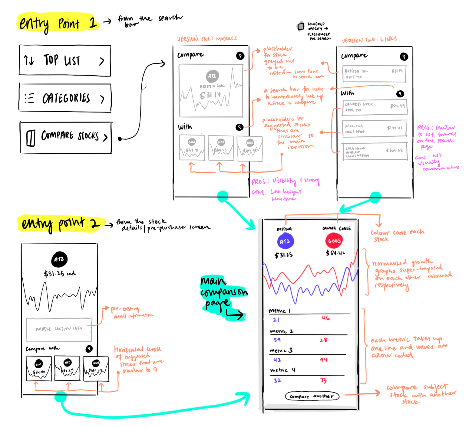 First Iteration
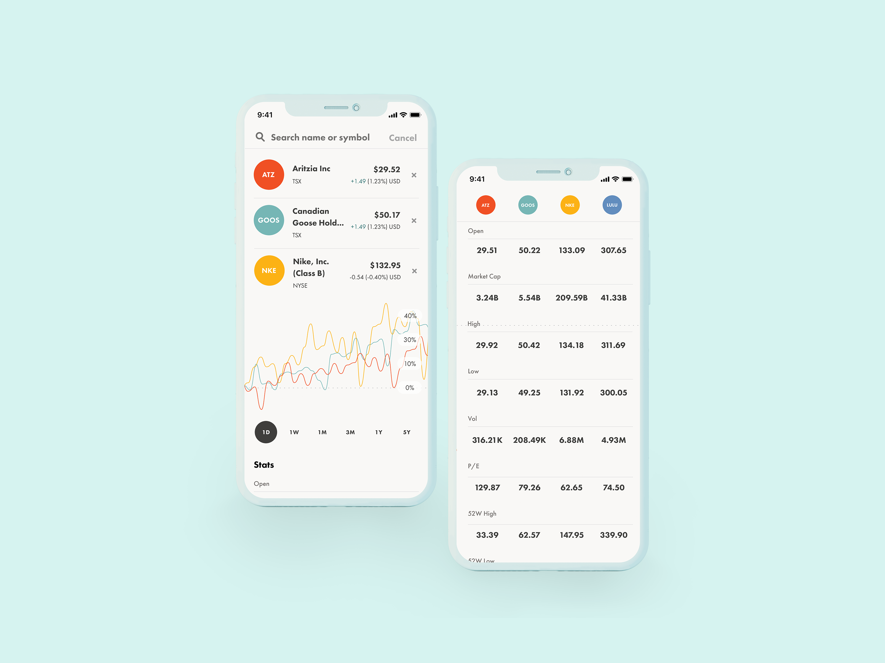
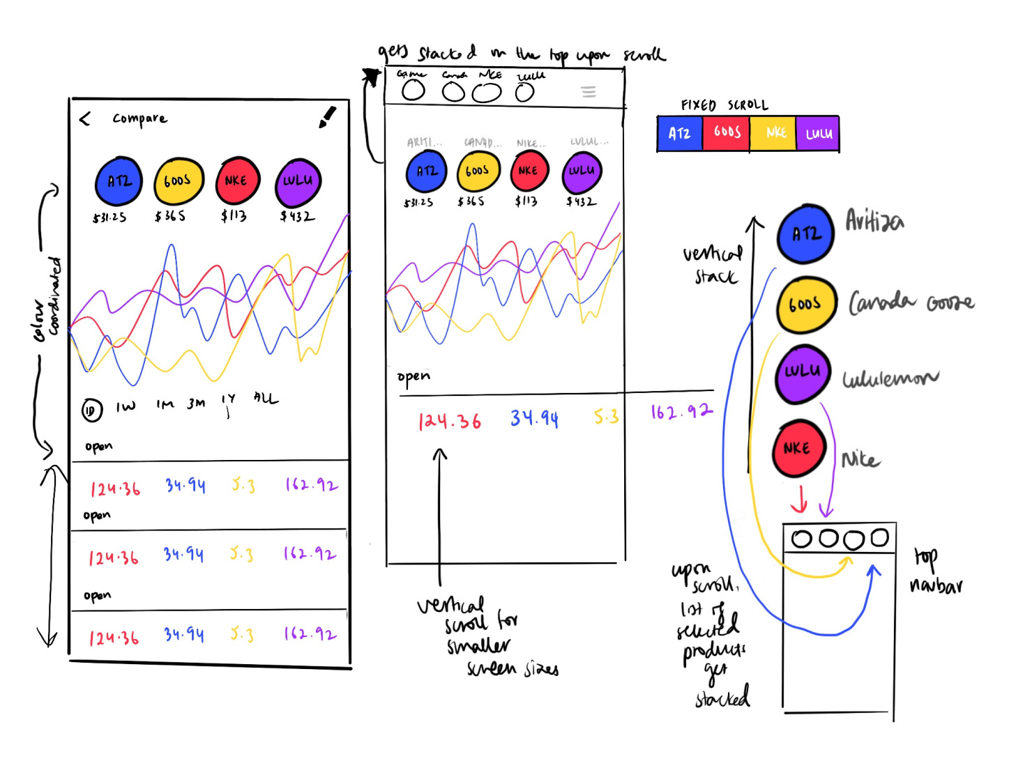
 Second Iteration
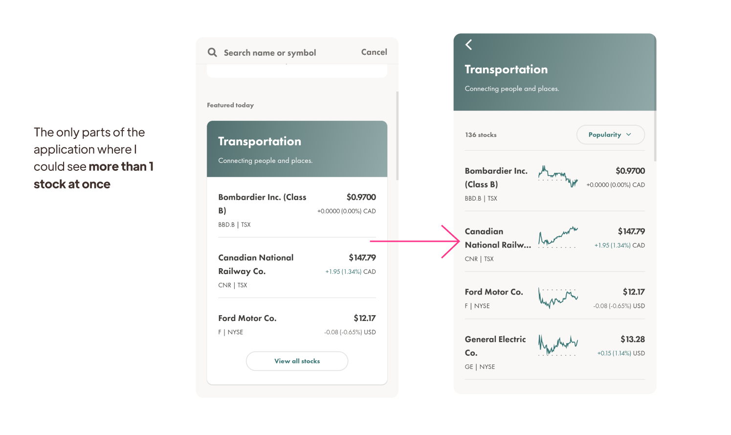
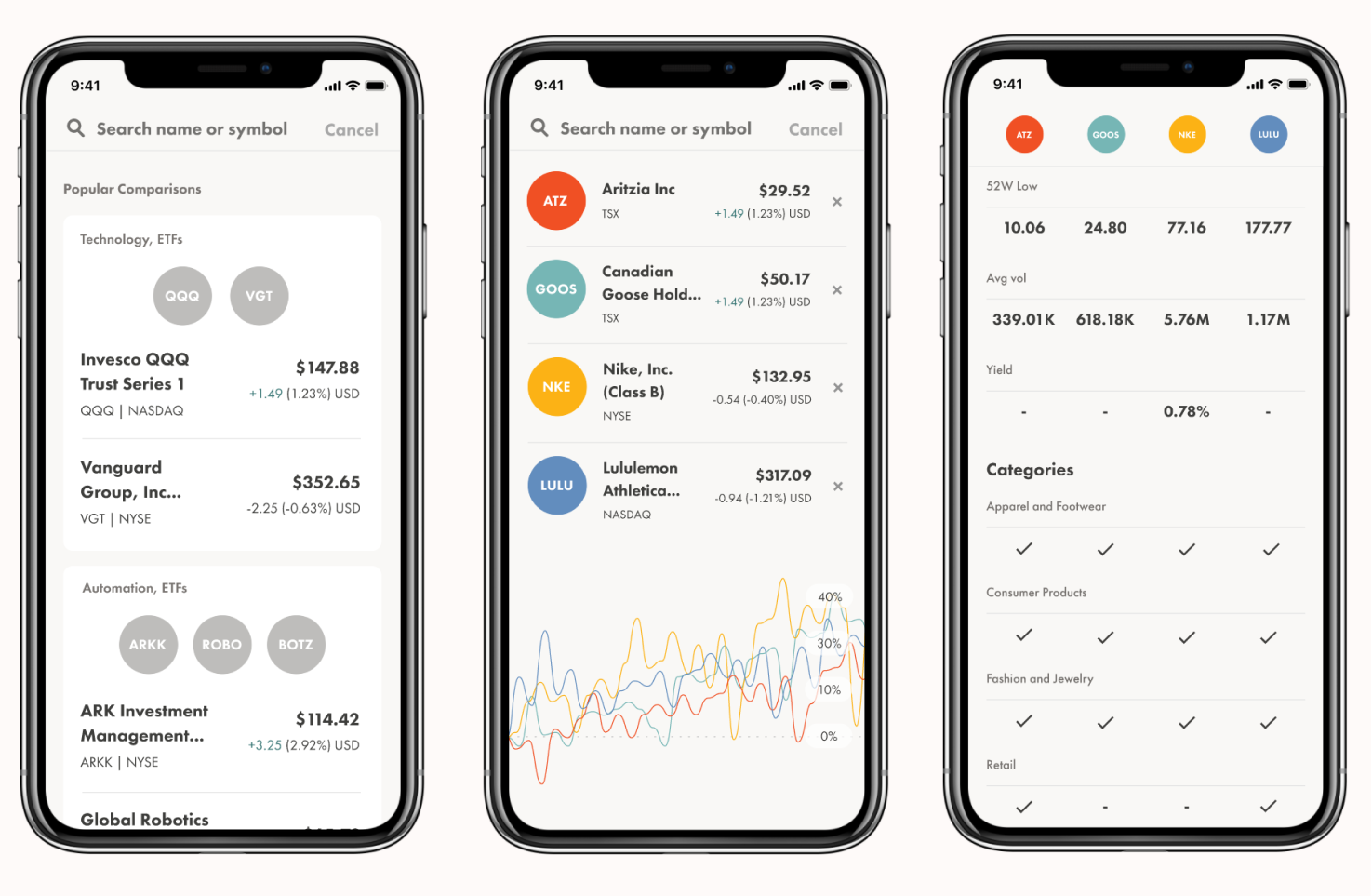
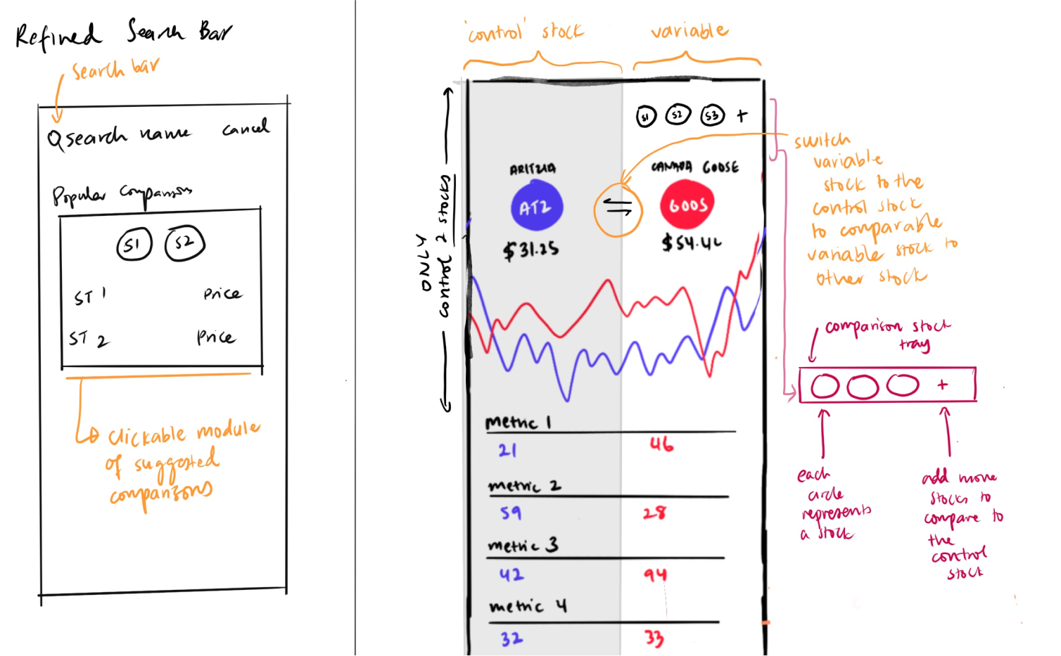
 Third Iteration