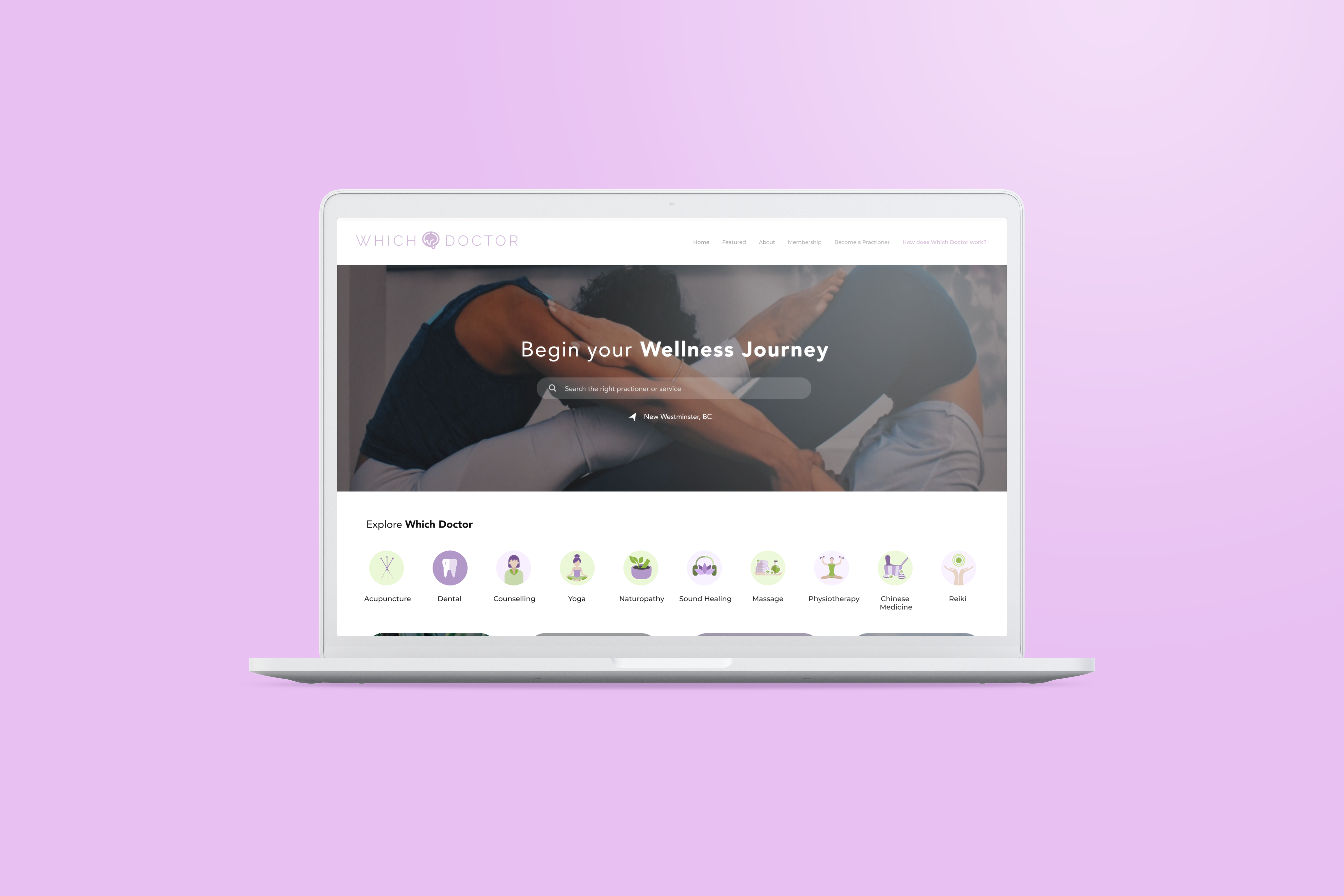
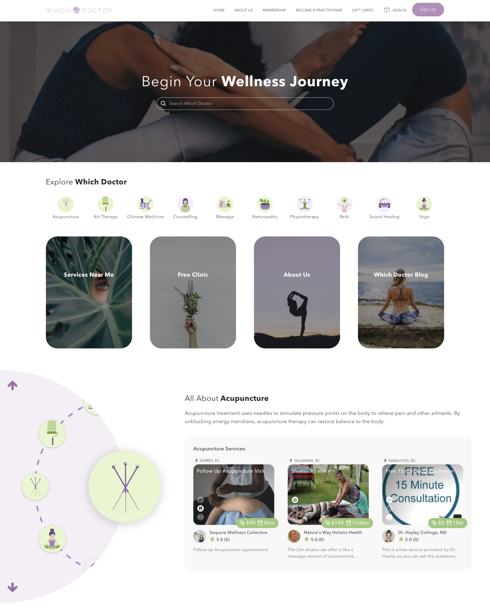
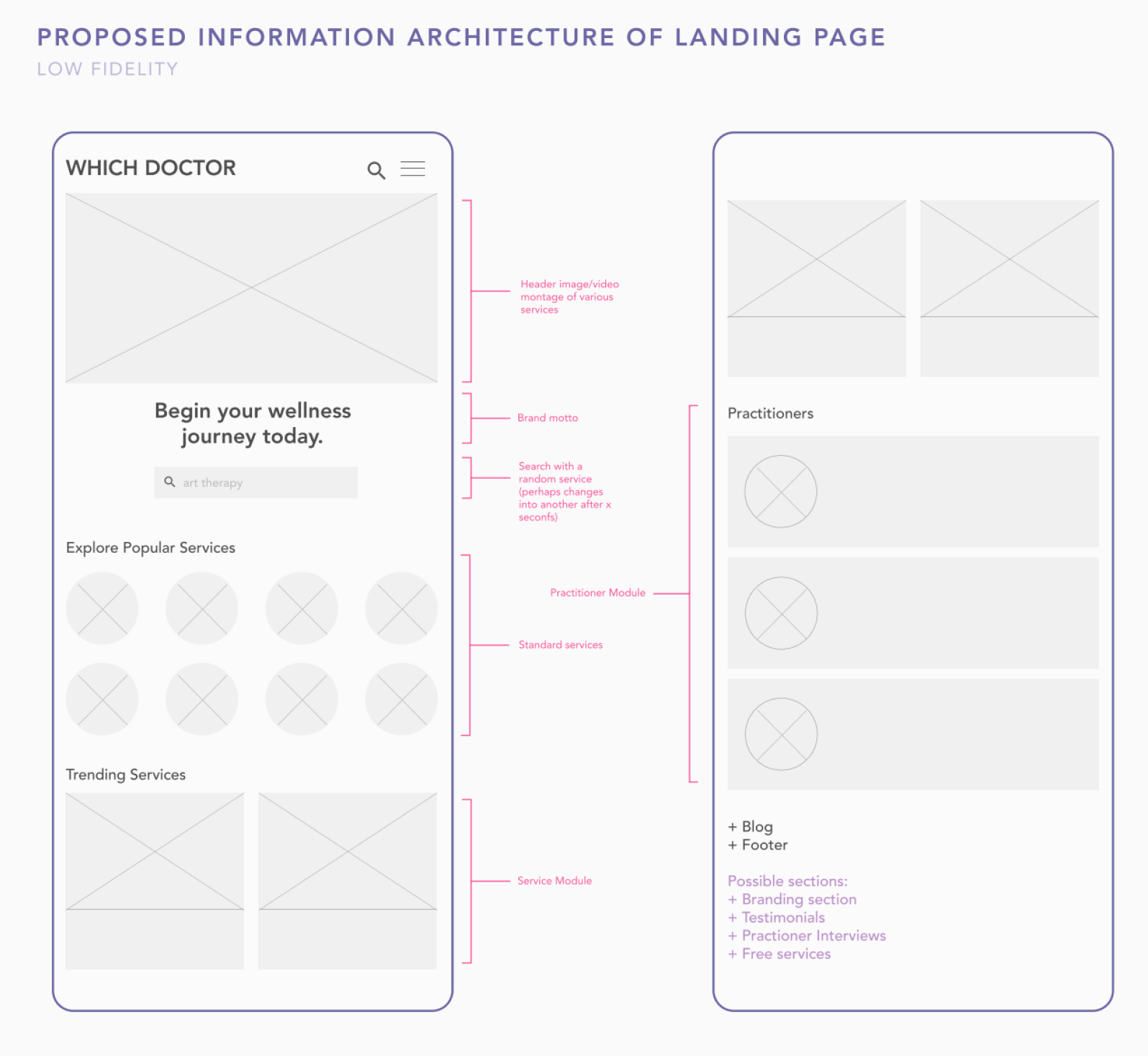
I worked closely with content strategy, web developers and our creative director to develop Which Doctor’s visual language and information hierarchy. My work was a culmination of various design techniques, such as developing a site-map, creating a user journey for our target demographic, A&B testing, competitive analysis and several rounds of iteration. I also took inspiration from P2P platforms such as Fiverr, AirBNB and travel platforms such as TripAdvisor in developing the user interface elements during the iteration phase.
Working for a Startup
Since Which Doctor was still in its infancy when I joined, I had the experience of giving the existing site a complete design overhaul. It was a challenging but fulfilling experience that taught me a lot about communicating a company’s ethos through visual design. This internship helped me to be more critical in my approach (asking myself: do I place this module there because it looks nice, or does it serve an important function to the user, for example), to strive for simplicity, accessibility and to meet usability heuristic guidelines for interface design for all phases of the design process. Working for a startup ultimately taught me the problem solving aspect of digital product design; the amount of research in terms of both market and user understanding that goes into creating design for the web became astonishly clear to me just a few months into working for the company.
Getting Creative
My time at Which Doctor also taught me to take advantage of my flair for visual design; to not shy away from being messy in the beginning while I was fleshing out ideas for the site’s branding. Due to my role as the sole user experience designer in the team, I had few constraints in the ideation process. As an artist, it allowed me to push my imagination to the next level. Experimenting with various mediums, design tools, exploring existing sites and applications and learning what worked and what didn’t was a truly riveting experience for me. This fuelled my creativity to the fullest and made me excited to go to work everyday to try out something new.


